Interiors at Christmas

Interiors at Christmas

Interiors at Christmas


Simple ways to make your home look festive for the season

We’ve been out and about looking at showrooms and shops and wanted to bring to you visual inspiration of ideas that you can easily translate before Santa arrives.

We always feel ‘less is more’ and remember you do not have to use the traditional green and red palette of a Santa suit and Christmas tree! In fact Christmas works best when it stems from the palette that you already have at home, with baubles, foliage and wrapping designs that co-ordinate and add some cheer to the existing colours and mood.

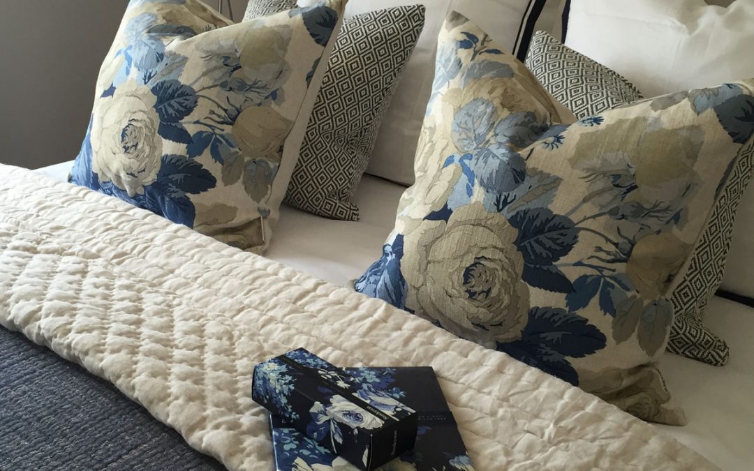
If you have a neutral home, with fur throws, chunky knits, a soft natural taupe palette, and earthenware/soft ceramics, then a contemporary rustic theme would work well. Brown paper packages, and yes ‘tied up with string’ (or simple silver ribbons from V V rouleaux)! and fir cones with a natural packaging tag would suit. For the place setting a dusky bark fabric coloured napkins, with a eucalyptus sprig, a white ceramic star, heart or bauble, tied with ribbon will look simple and effective. Fill shallow bowls with decorative balls the colour of putty, cement, juxtaposed with fir cones and small ivy sprigs. Twigs, mistletoe and white berries feature as decoration on the mantel in oversized glass vases.

Remember to use your furniture almost as props for display, low bench footstools with Christmas present boxes ready to open, a fur throw added/slung over the side makes the area inviting, tempting and warming. On top of a dresser, sideboard or mantel, add leavey green foliage and white pea lights. We also love adding fresh (or faux), sprigs of December stems into our natural Christmas tree. Ivy, eucalyptus, and any other leavey stem (as long as a contrast), works well and adds depth. With silver baubles and white pea lights that shimmer from behind all the added decoration.

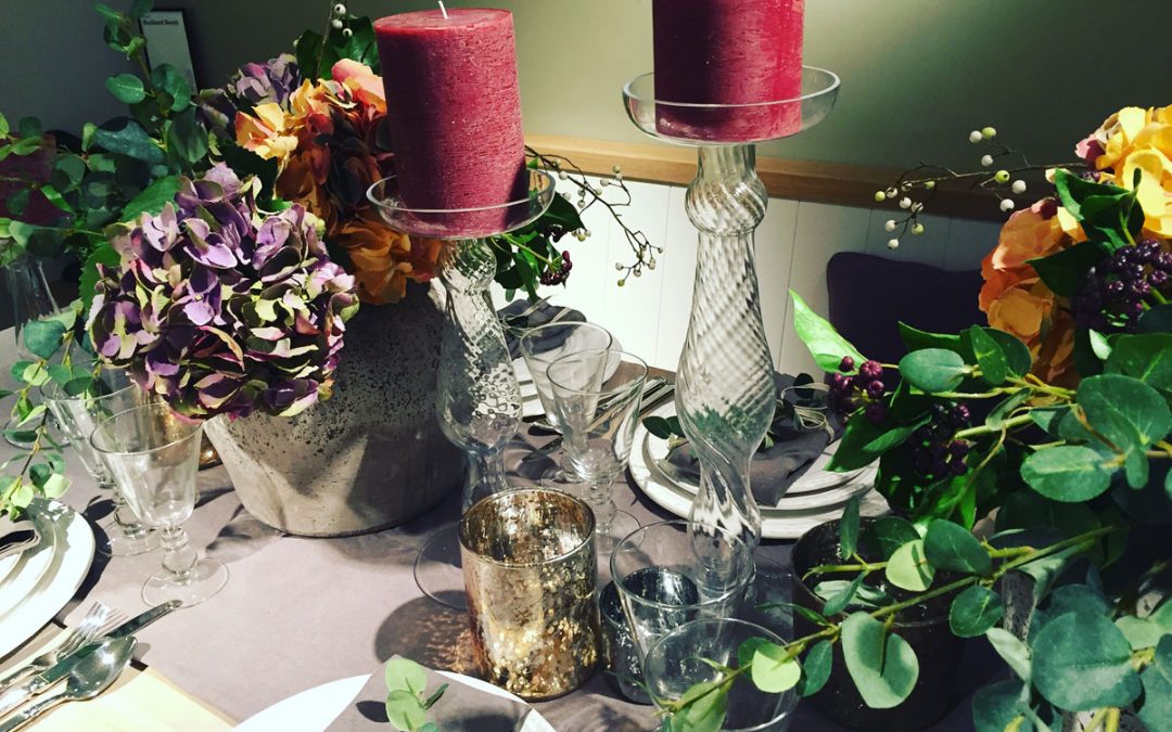
Another palette that offers a point of difference would be a rich warm autumnal one and one that extends into Christmas. Think of dried hydrangea flowers in purple russet tones with a contrast of ochres and green leaves. Rich warm candles in tall glass holders make this harvest festival palette translate into Christmas. A little vintage and individual too.

More Christmas inspiration soon!

How to Dress a Bed

How to Dress a Bed

How to Dress a Bed


We’ve dressed more than a few beds in our time! We thought we would share some tips with you. Key to us is layering, comfort, contrast and focal points – whether it be the cushions or the height and shape of a headboard.

We love using a couple of throws as this gives both a luxury element and contrast of materials/textures and allows placing colours tonally together. Either drape a throw on the edge of the bed or fold over the base as a band of colour.

Accent dress cushions on the bed need to have feather infills, which gives you plumping ummph! You can use two larger cushions at the back with two smaller in front. (This tends to work well on a double). For larger bed sizes it is nice to use three cushions at the back with two in front for balance and symmetry. Cushions that vary in size are perfect for that ‘wow’ factor.

We have a thing for contrast piping on cushions, which always gives a lovely contrast and visual reference for the eye.

Headboards, you can have some fun here with upholstered options; tufted, piped, buttoned, trimmed with braid, and shaped. Perfect for balance and height in the room and for lounging against in the morning with coffee and croissants!

With bedlinen we always like to use a high thread count and are a big fan of white! It always looks so crisp, clean and classy. Depending on the project and bedroom we like to use oxford and housewife pillow cases together. Using european square pillowcases, (to prop up towards the back), add another luxury layer and give a new shape. We like to use a flat sheet between a covered mattress and duvet cover, or either a fitted sheet or flat, over the mattress. Remember to use an extra deep fitted sheet if you have a mattress topper too.

And always have a lovely breakfast tray to hand for the mornings and personal little artefacts as well. Accessories such as frames, an alarm clock a couple of books. Personal items that you love, on the bedsides, that give a sense of you.

Remember it’s your space, a sanctuary to unwind and you deserve the best!

Kitchen Neutrals

Kitchen Neutrals

Kitchen Neutrals


Amongst our show homes and buy to let properties for investors, kitchens tend to be neutral, modern but above anything else functional.

Key considerations for a kitchen are the individual’s requirements, ‘the cook’, how the user lives and entertains from day to day. For some projects, however, we do not know the end user, so a well stocked kitchen with all mod cons, appliances, boiling water tap, adequate bins with re-cycling options and ample storage, become core basics.

For simplicity flushed cabinets, handleless with push catch doors and drawers, in a neutral palette whether matt or low gloss. With additional features like a glass effect finished/edged fronts. Light coloured work surfaces, with quartz being both practical and having a good range of whites, creams and natural taupes. Colours which reflect the light and the material being available with subtle accent flecks of contrast hues within.

Always think of kitchen lighting; utilise wall cabinets with recessed lighting beneath, which in turn shine on the work surfaces, to feature pendant lights above an island. Be sure you have enough power sockets and that they are in the right places.

Good ventilation is a must, especially above the oven/hob and there are many design hoods, extractors, to bring a focal point to the room and a new material.

For adding contrast and a splash of colour, use a darker tone of paint on the walls, or an accent colour in the splash back, whether glass, or ceramic. Geometric tiles look great too and are on trend.

Classy accessories; oversized dishes, bowls, jars and cake stands, think about what you use regularly, need to hand and invest in some lovely statement pieces on the worktops.

Teenager Bedrooms

Teenager Bedrooms

Teenager Bedrooms


Their own space to create!

We aim to look at this one through the eyes of the teenager! Remember that they see the room as their den, more than a place to sleep and somewhere they can escape to and have their own collections and paraphernalia of ‘stuff’ associated with hobbies, school, music, etc!

As if it were their own mini apartment, consider areas for work, play and sleeping, – when space permits. They want to hang out with friends, do homework and switch off in a space that reflects their personality and tastes.

For our teenager room at Cintra, we wanted to reflect a vibrant room with energy with the orange, black, grey palette and simple modern furniture for bedsides, and a desk area for study – with bright prints showing a love of planets and music. This room was quite graphic in style and functional with the oversized clock and leaning bookcase, not fixed on the wall. This allowed the possibility of moving the floating shelves to the desk area when needed, or just for a refresher of the room! There was enough space left on the rug, to add an easy chair or floor cushions for when friends popped by.

Wall Units

Wall Units

Wall Units


Featured from Cintra Park, Crystal Palace

The benefits of a wall unit are endless, within a small space they are a great storage solution
allowing you to optimise limited space in your home. Storage, for not only books, collections,
interior accessories – but also for technology, allowing you to hide cables and sockets.

The key is to have a design that is both functional and decorative, tying in with your interior scheme and much loved vases/ornaments/sculptures. Remember to always measure everything that needs to be ‘hidden’ to ensure it fits and the storage compartment is designed for the function of the end purpose.

A wall unit frees up space, as usually (with flat TV screens), the depth is kept to a minimum and makes the room feel ‘open’, especially when a floating unit.

We’ve shown the wall unit from Cintra, to illustrate above, with the lovely rich oak grain and contrast of white low gloss finish. Using a collection of vases in various hues, textures and sizes for impact in the unit.

Art in Interiors

Art in Interiors

Art in Interiors


A way to add colour, mood and style instantly to an interior, with an image you love!
Featured from our Queensgate, Cintra and Pimlico projects.

We wanted to feature some of the art pieces used in some of our projects and to give you a few tips when hanging your own works of art.

Art pieces including prints, paintings, canvases, should never be an afterthought but always considered at concept creation stage. A carefully selected or commissioned piece of art, not only brings the whole room palette together (drawing on colours and textures used from cushions, upholstery, curtains and colours of wood grains) but also breathes a sense of life.

In a large open plan room that is part dining and part living, two images (one in each part), tie the two areas together and in fact allow you to use and draw out part of the palette in each. For example in our Queensgate dining space the hues of the cabinetry and grey blue of the velvet dining chairs came from the painting, with the orange coming through in the copper display items. In the living part orange featured more strongly, as an accent colour on cushions. Allowing for a little more colour in the living part and more sophisticated tones in the dining area. Below are some images of our orange and blue landscapes to illustrate above.

Art work really has the same principles of a ‘3 colour pattern fabric’ that you are working with, thus allowing you to utilise all the colours within, individually, in the room.

Always remember that placement in relation to your furniture and size of the art work is key to create balance and harmony.

A single piece of statement art works well, especially in a more modern space and if a limited budget. There are some great prints on the market, whether colour or black and white. We’ve included some images of a ‘Twiggy’ print, which we used as an accent ‘wow’ feature in Cintra Park, a modern room with a feature wall unit and low slung sofa.

Our other tip would be ‘collections’ of images, with the same theme/palette and coloured frame. This works well in narrow spaces, for example ‘going up the stairs’ and on landings, where it is nice to have a focal point of interest. At Queensgate we used black and white photographic images of the stage and screen.

To create a cameo collective grouping, prints above bedside tables, (when a tall feature upholstered headboard is used) give some interest/height either side and balance out the wall. An example of this would be our black and white mirrored images used either side of the bed in the master bedroom at Queensgate.

Above all, have fun and use images and art work that has a personal connection to you and that you love!

You will then be giving your home a lovely narrative that comes from your heart and is as individual as you are.

Pin It on Pinterest