Design Trends – Orange (colour predictions for 2017)

Design Trends – Orange (colour predictions for 2017)

Design Trends – Orange (colour predictions for 2017)


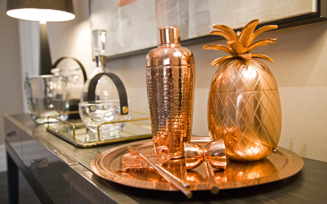
2016 saw copper and rose gold big time! This will evolve into softer terracottas, blush neutrals, and burnt amber and oranges for a more sophisticated colour story.

There will be a shift away from the copper ‘full on frenzy’, with more softer warmer metallic hues like bronze, metals more weathered and beaten and with a more lasting, authentic quality – metal hues that have more longevity in interiors, and indeed work within more styles and palettes too.

An overall trend is that the world is changing, becoming more frenzied and the home will become more collected, treasured with the need to spend less time with technology and social media. Hence the need to create balance, and escape within an interior. Remember it is a ‘home’ after all! There will be a move to go ‘offline’, to get away from the laptop, iPhone, to communicate with each other the old fashioned way! So we will see relaxed furniture and a more creative homely use of space. From reading nooks, the outside coming in, and garden upmarket ‘shed’ bolt holes.
Design Trends – Blue Seascape (colour predictions for 2017)

Design Trends – Blue Seascape (colour predictions for 2017)

Design Trends – Blue Seascape (colour predictions for 2017)


With the emerging colour and paint trends from pantone to dulux, there will be a return to nature and coastal/seabreeze influences. From blues, greys, greens to soft light neutral hues. Surfaces such as marble, stone, agate – all with a natural mineral quality will feature strongly in interior product. From decorative small accessories to inlay in occasional accent furniture.

This trend of marble, and agate will be seen strongly in surface design too, taking its cue from nature – for example the movement, grain and colour of rock formations, and will be reflected in statement pieces like a kitchen island worktop. Small scale on ceramics, with wallpapers reflecting this tend for more movement and larger surface patterns.

Green, ‘Greenery 15-0343’, being pantones colour of the year will feature, and green in all shades from soft celadon to emerald. And if your not keen or brave enough to use on a large scale – add fun elements with cushions, detailing, a rug, accent chair or the feature colour within a bespoke art canvas.

The use of blue will grow too, with dulux announcing it as its colour of the year, as part of its annual global colour futures trend forecast. The colour ‘Denim Drift’, a shade described as ‘a beautiful, timeless and versatile grey-blue that takes on a different characteristic depending how it is used’, will be strong. And note three blues feature strongly in one of Pantones top 10 palettes, named ‘Fathomless’ for this year, to contrast with ‘greenery’ 15-0343.

Grey will remain and stay strong, a colour that works well with both the blue and green, noted above, hence will feature in this coastal palette.

This seascape palette is great for all things natural from coral, driftwood, rough surfaces and trend predictions are even seeing the return of cork!

Pin It on Pinterest